css
Interesting resources
what is css
CSS is an acronym for Cascading Style Sheets
so the question should be: What are CSS?
CSS defines how a web page should be rendered by the browser
html
A web site without styling displays just the structure
html
css
Separation or structure and design of a web page
html
html
css

Sharing and modularization of design for different html files
html
css

Different design for different targets (desktop, mobile, print)
Combine CSS and HTML
Inside a HTML style element
As an external resource in HTML with a link element
Inside the style attribute of the HTML element`
In Javascript as a constructable stylesheethttps://developers.google.com/web/updates/2019/02/constructable-stylesheets
This will be important later on when we discuss custom elements/web components
Structure of a CSS File
@import 'other.css'
html {
color: #000;
padding: 5px 5px;
...
}
div, p { ... }
@media print { ... }
@import 'other.css'
html {
color: #000;
padding: 5px 5px;
...
}
div, p { ... }
@media print { ... }
@import rule to import other css files
@import 'other.css'
html {
color: #000;
padding: 5px 5px;
...
}
div, p { ... }
@media print { ... }
one or multiple selectors
@import 'other.css'
html {
color: #000;
padding: 5px 5px;
...
}
div, p { ... }
@media print { ... }
rule block
@import 'other.css'
html {
color: #000;
padding: 5px 5px;
...
}
div, p { ... }
@media print { ... }
one or multiple properties
@import 'other.css'
html {
color: #000;
padding: 5px 5px;
...
}
div, p { ... }
@media print { ... }
one or multiple values
@import 'other.css'
html {
color: #000;
padding: 5px 5px;
...
}
div, p { ... }
@media print { ... }
a @media rule with rules which only apply if the media query matches
Inline CSS can only have properties, so you can't use media queries
a css stylesheet can import other css files
a css stylesheet can have multiple rules
a css rule can have multiple properties
a css property can have multiple values
a css file can have specific rules for specific media types
multiple values are a shorthand for multiple properties
is shorthand for
Selectors
selectors match the css rules to the elements defined in the html structure
h1 selector match the h1 elements
h2 selector match the h2 elements
p selector match the p elements
There are different types of selectors
Type selector, Universal selector, Class selector, Attribute selector, ID selector, Pseudo selectors
Universal selector
The universal selector * matches all elements
type selector
The type selector element matches all elements of the same type
id selector
The id selector #id matches all elements with the same id
class selector
The class selector .class matches all elements with the same class
attribute selector
The attribute selector [attribute=""] matches all elements which have the
attribute with a specific value
pseudo selector
The pseudo selector :pseudo() matches all elements which mach the specified
pseudo selector
Combination of selectors
selectors can be combined to narrow the space of elements to apply the rule
Selectors can be combined with the operators ,, +,
~, , >
concatenation or "logical and"
matches all elements which have the id "id" and class "class"
, "logical or"
matches all elements which have the id "id" or class "class"
general descendent combinator
matches all elements with class "class" which descend element with id "id"
> direct descendent combinator
matches all direct children with class "class" of the element with id "id"
~ general sibling combinator
matches all span elements which follow to a p element and have the same parent
+ direct sibling combinator
matches the span element which follows directly to a p element and have the same parent
All these selectors can combined with multiple combinators to refine the rule
Select any (*) element OR the 4th child which hast the id="main", the class "substrcuture" and a "data-id" attribute with a value containing "5"
Specificity and the Cascade
or why the hell is my text not red?
User Agent Stylesheet
is overwritten by
Author Style Sheet
If multiple selectors match the defined properties will be merged
text
All selectors match for the element so all properties (color, background-color, border-color are applied
text
If multiple selectors match and contain contradicting properties there is a hierarchy which properties will be applied for the specific element
text
The element will be red because the #red rule is the most specific one
text
First the specificity will be calculated
| 0 | 0 | 0 | 0 | 0 |
Every matching type selector div and pseudo element ::before will increase the type specificity
| 0 | 0 | 0 | 0 | +1 |
Every matching class selector .class, attribute selector [attr~=""] and pseudo class (:hover) will increase the
class specificity
| 0 | 0 | 0 | +1 | 0 |
Every matching id selector #id will increase the id specificity
| 0 | 0 | +1 | 0 | 0 |
Every property declaration on the style attribute will increase the style
specificity
| 0 | +1 | 0 | 0 | 0 |
Every property with !important will increase the important specificity
you probably never need important, and if there is always another solution
| +1 | 0 | 0 | 0 | 0 |
If there is a tie on specificity ...
text
... then the last rule defined will overwrite the preceding rules
text
selectors concatenated with +,
~, , >, :not() will increase the type specificity
test
The specificity for the selected rule is 0 0 1 for the selected element
test
The specificity for the selected rule is 0 0 2 for the selected element
test
The specificity for the selected rule is 0 1 1 for the selected element, so the
background color of the element will be yellow, despite the css rule is defined before the other rules
User Agent Stylesheet
is overwritten by
Author Style Sheet
is overwritten by
Specificity and Cascade
is overwritten by
Element Style
is overwritten by
!important
Inheritance
Some properties will be inherited from the parent elements (color, font, custom properties)
I will be blackI will be red
I will inherit color from my parent
I will be black again
Inherited properties also bleed into the shadow dom
I will be blackI will be red
I will inherit color from my parent I will be black again
More Information
Values, Units and Functions
a css property can have one or multiple values, these values can be of different type
            div {
              height: 23px;
              border: 1px solid #fff;
              color: rgba(10,255,142, 0.5);
            }
number
number types can be used either as direct values for specific properties
flex: 1 1 auto;
or as arguments for functions
color rgb(0, 0, 0);
string
strings can also be used as values
If the string does not contain spaces, the " can be omitted
border-type: solid;
content: "my content";
lengths
There are two types of length, absolute lengths and relative lengths
Absolute lengths
Absolute lengths do not relate to anything else and are usually always the same size
| unit | name | equivalent to |
|---|---|---|
cm |
Centimeters | 1cm = 96px/2.54 |
mm |
Millimeters | 1mm = 1/10th of 1cm |
Q |
Quarter-millimeters | 1Q = 1/40th of 1cm |
in |
Inches | 1in = 2.54cm = 96px |
pc |
Picas | 1pc = 1/6th of 1in |
pt |
Points | 1pt = 1/72th of 1in |
px |
Pixel | 1px = 1/96th of 1in |
Pixel and retina resolutions
A CSS pixel does not map to a native pixel
The size of a CSS pixel depends on the DPI of the users hardware and the scaling factor of the operating system
Relative lengths
Relative lengths are relative to something else, for example the parent element, the viewport or the root element
| Unit | Relative to |
|---|---|
em |
Font size of the parent, in the case of typographical properties like
font-size, and font size of the element
itself, in the case of other properties like
width.
|
ex |
x-height of the element's font. |
ch |
The advance measure (width) of the glyph "0" of the element's font. |
rem |
Font size of the root element. |
lh |
Line height of the element. |
vw |
1% of the viewport's width. |
vh |
1% of the viewport's height. |
vmin |
1% of the viewport's smaller dimension. |
vmax |
1% of the viewport's larger dimension. |
fr |
'fraction' layouts the elements in fractions, helpfull in grid because it take grid-gap in account |
relative sizes explained
normal size double size normal size again
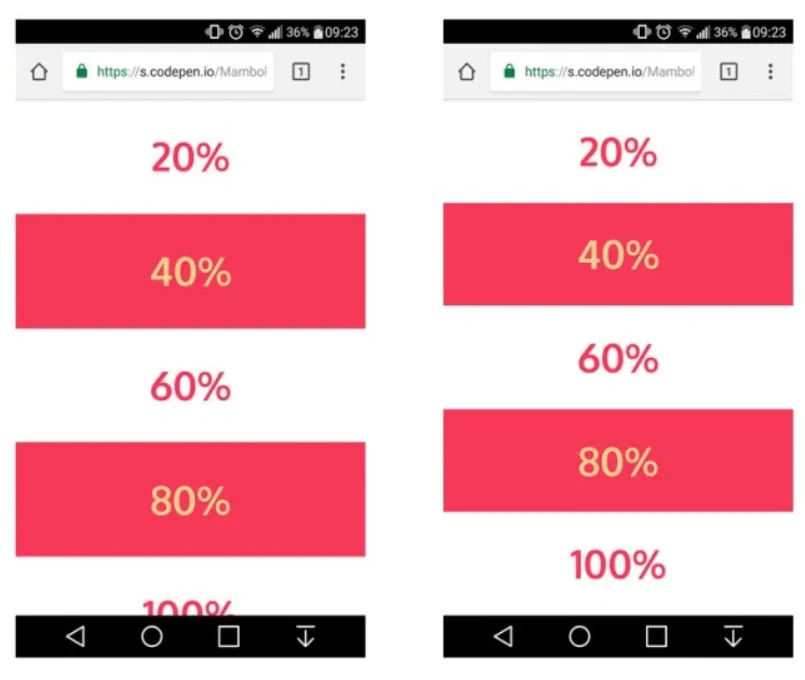
vh and mobile devices
vh unit
Equal to 1% of the height of the initial containing block.
On Safari vh is calculated with the navigation bar extended and does not recalculate on scrolling
Percentages
%-percent values are not always relative to the same property of the
parent element
font-size: 50% is relative to the parents font-size
width/height: 50% is relative to the parents containing block
size
transform: translate(-50%, -50%) is relative to the
elements own width/height can be used to center an element
padding: 0 50% a percentage value is relative to the elements own
width, this can be used for fixed-ratio elements
Colors
Colors can be defined via keywords, hex string or specific functions
Functions
There are several built-in functions in CSS
url() can be used with background to set a
background image
calc() can be used to calculate values (e.g. calc(50% - 3em))
Special values
inherit will use the value of the property defined in the parent element
unset will unset values inherited from parent elements
initial will reset the value to the default value
Custom properties/Variables
It is possible to define custom properties in css and use them as value
Custom properties are inherited from parent elements and thus bleed into the shadow dom
CSS Positioning and Layouts
Box Model
Text
the box model affects the layouting of an element and the calculated width or
height of an element
the box model consists of 4 boxes, the margin box, border box, padding box and content box
margin: <value>border: <value>padding: <value>width, height
the sizes of the different box dimensions can be set with the css properties margin, border, padding,
width and height
margin: <value>border: <value>padding: <value>box-sizing: content-box; is the default box model for elements and applies the
set height or width to the content box
margin: <value>border: <value>padding: <value>box-sizing: border-box; takes the elements padding
and border box into account while layouting the element with a set width or height
With content-box the width only applies to the
content box of the element, so the elements calculated width after layouting is 700px + padding + border,
and the content box width 700px
With border-box the width applies to the border
box and includes the border and padding of the element, so the elements calculated width is 700px, and the
content box width 700px - margin - padding
containing-block
the size and position of an element are impacted by its parent containing block, different properties change the containing block which is used to calculate an elements dimensions
for example a percent value for width usually take the ancestors
content-box as the
containing block a calculates the width relative to the ancestors content-box
block layout
default for block elements (p, div, ...)
can be set with the css property display: block;
always take up all available width of the parents content-box
block elements will alway stack vertically
inline layout
default for inline elements (span, sup, ...)
can be set with the css property display: inline;
width and height have no effect (with the exception
of display: inline-block;
inline elements will vertically align per default to the baseline and wrap if the horizontal space exceeds the available horizontal space of the ancestors content-box
Flex Layout
display: flex lets you control the vertical or horizontal distribution and
alignment of block level elements
used for more dynamic and responsive layouts
If you need a 2-dimensional layout with unknown numbers of children prefer a flex layout over a grid layout
A flex layout always needs a container element which controls the positioning of the direct children
Set the layout type to flex
Aligns the items in a row
Prevents the wrapping of flex items if their content doesn't fit into the containers width
Aligns all items to the left side of the container
Allows items to stretch if there is space on the cross axis
Align items to the top of the container
The first item will not grow and will not shrink and will always be 30px wide
The second item will grow and shrink if enough space is available
The third element will not grow and only shrink to the point its content will still fit inside
Content Area, Items
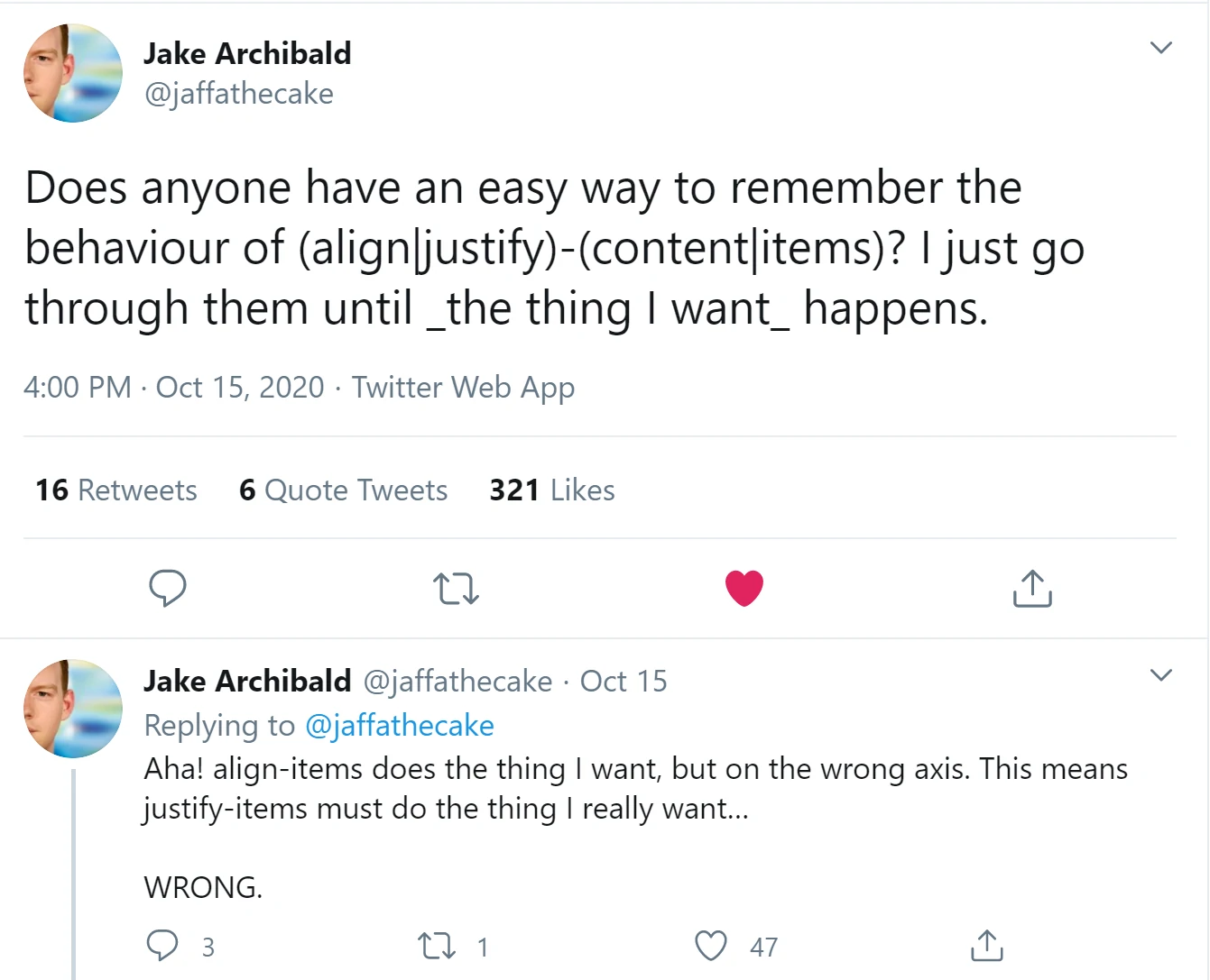
But even the most experienced people need to look in the spec for a specific behavior
Grid Layout
display: grid lets you align block elements according to a defined grid
perfect layout for multi dimensional layouts
table on stereoids
A grid like a flex layout always needs a container element which controls the positioning of the direct children
Set the layout mode to grid
Set a template for the grids columns
In this case 5 columns, where the 1st, 2nd, 4th and 5th have a fixed width and the middle column takes up all remaining space
Set a template for the grids rows
In this case 3 rows where the first is 25% of the available space, the second 100px and the last takes up all remaining space
leave a gap of 10px horizontally and vertically between the grid cells
The first cell starts at position 1/1 of the grid and spans 1 row and 1 column
The second cell starts at position 1/2 of the grid and spans 1 row and 1 column
The third cell starts at position 1/3 of the grid and spans 1 row and 1 column (the auto column)
The fourth cell starts at position 1/4 of the grid and spans 1 row and 1 column
The fifth cell starts at position 1/5 of the grid and spans 1 row and 1 column
The sixth cell starts at position 2/1 of the grid and spans 1 row and 3 columns
The last cell starts at position 3/3 of the grid and spans 1 row and 2 columns
If you layout a grid item on a row or column which does not exists, for example if the grids size is not
known in advanced the missing rows or columns will be initialized with a width of 0 and the last one with auto
you can however overwrite this behavior with the grid-auto-rows and grid-auto-columns property
for easier placement it is possible to name areas within a grid and position your elements according to the name
With grid areas you can assign names to different parts of your grid
The areas must only be rectangles
Float
the float property will remove the element from the normal flow and wrap the
following content around the element
a float value other than none will automatically apply a display: block; to the element
should only be used to control flow of content, for everything else use grid or flexbox
display and visibility
There are two ways to hide an element present in the DOM which behave different
display: none will remove the element from the layout so its dimensions will
not be used in layout calculation
visibility: hidden will just not render the element but its dimensions still
effect the layout
Positioning
static
default position for block level elements
relative
Same as static but children elements with an absolute positioning will use the
containing-block of the relative element to position them selfs and the relative positioned element is moved
by the offset defined in the top, left, right, bottom property
absolute
positions the element relative to the nearest ancestors containing-block which has the position relative, absolute or fixed
fixed
positions the element relative to the viewport or to the nearest ancestors which has a transform, perspective, filter
Stacking Context
The stacking context defines the order in which elements that overlap will be drawn and is defined by the
order and depth of the elements within the HTMLs DOM and can manually be created by the css properties z-index, opacity, transform
Stacking defined by dom level
            1
                1.1
                  1.1.2

                1.2

              2
1
            1
              1.1
            1
              1.1
                1.1.2
            1
              1.1
                1.1.2

              1.2
            1
              1.1
                1.1.2

              1.2

            2
            1
              1.1
                1.1.2

              1.2

            2
            1
              1.1
                1.1.2

              1.2

            2
            1
              1.1
                1.1.2

              1.2

            2
Complex Example with z-indices
Division Element #1
position: relative;

              z-index: 5;
Division Element #2
position: relative;

              z-index: 2;
Division Element #4
position: relative;

                z-index: 6;
Division Element #3
position: absolute;

              z-index: 4;
Division Element #5
position: relative;

                z-index: 1;
Division Element #6
position: absolute;

                z-index: 3;
Animations and Transitions
Animations
You don't always need javascript to animate your elements
https://www.w3schools.com/css/css3_animations.asp
CSS animations are defined with the animation property which references to a
at-rule with the defined keyframes
an animation property which refers to a set of keyframes
definition of keyframe transitions
By using CSS animations, the browser will calculate the changed properties between keyframes and will automatically animate these changes
Transitions
Transitions are similar to animations but will trigger if the CSS selector matching changes, for example on
a state change to the pseudo class :hover
this will run a transition for all properties which the current selector rule changes
height will not be animated because it is not defined in other matching
rules
This transition animation will play if the state changes and the :hover pseudo
selector does not match anymore
The height will not be animated on hover because the origin properties do not contain a height property
We can fix this by adding a height property
Responsive Designs
@media queries
The @media {} at-rule or the media attribute for
link and style elements let you control what styles
should be applied depending on the screen type of the user, the viewport size or preferred color schemes
@media screen and (min-width: 900px) {
rule {}
...
}
@media screen and (min-width: 900px) {
rule {}
...
}
@media at rule
@media screen and (min-width: 900px) {
rule {}
...
}
@media query list
multiple conditions can be concatenated with and, or, not or only
@media screen and (min-width: 900px) {
rule {}
...
}
CSS rules to apply if the condition matches
With the help of media queries it is possible to provide different CSS styles and layouts for different viewport sizes (mobile, tablet, desktop) or for print without the need to change the structure of the HTML
The queries can be arbitrary complex and there are a lot of function to query
@container queries
experimental feature
since @media queries only work on the global viewport container queries where introduced to allow arbitrary elements as a reference for responsive design
define a container
content will query the nearest container and its size
containers can be named for scoping
Scope
Besides of selectors and specificity CSS offers no way to scope your CSS to a selected sub tree within your HTML DOM. If you work with a lot of teams on different parts of a web page this can lead to problems if your class names, ids or selector collide
There was a proposal which never caught traction with a attribute scoped
for style classes, so this should not be used anymore
Currently there are some solutions involving CSSinJS (for example styled elements in react) or tooling like https://github.com/css-modules/css-modules which requires additional tooling
The only solution provided by the browser platform for scoped CSS is the use of Shadow DOM